


|
||

|

|
|

|
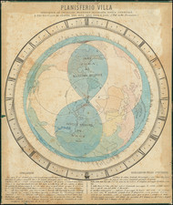
Early Climate Map of Earth
This beautiful map is an early scientific attempt to measure global temperatures and the distribution of heat across the world. Using isothermal and isoabnormal lines, the map connects areas with similar average temperatures or deviations to average temperatures to create a view of the world's global temperature.
The map is quite vivid, choosing to color code each section either red or blue. For the isothermal lines, red indicates above-freezing averages, while blue denotes below-freezing averages. For isoabnormal lines, red shows temperatures warmer than expected, and blue highlights cooler areas.
The maps in this chart feature data from annual measurements as well as measurements taken during temperate extremes in January and July. The bottom four maps focus on the Northern and Southern Hemispheres' isothermal averages, mostly red with blue around the poles. The last two maps portray the Northern Hemisphere's isoabnormal temperatures in January and July.
This map is an intriguing piece of scientific history that gives a modern viewer a glimpse into the climactic past of our world. The map also provides insight into the scientific observations and methodologies of the mid-19th century as this map attempted to catalog average temperature across the globe. Overall, an excellent display of cartographic skill and scientific knowledge.
![(Second World War) Newsmap -- Monday, November 23, 1942 [on verso:] Life Save #2 Winning Friends - Helping People](https://storage.googleapis.com/raremaps/img/small/94937.jpg)
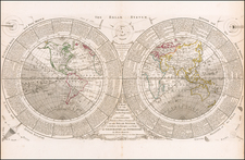
![[The centre of this Slider is to be placed by a Thread or Pin over the centre of the respective Planisphere for any Operation]](https://storage.googleapis.com/raremaps/img/small/65557.jpg)