


|
||

|

|
|

|
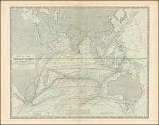
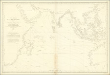
This 1856 chart by W. & A.K. Johnston is a detailed representation of the Indian Ocean, integrating critical navigational and meteorological information. It visually communicates the regions prone to monsoons and typhoons with green, yellow, and red lines, while trade winds are indicated in orange and blue, highlighting their importance for maritime trade.
Of primary interest in this chart is the scientific data that is illustrated with color. Regions susceptible to monsoons and "Ty-foons" like Bengal, Sumatra, and Ceylon have green or red lines above them to indicate the range of these storms. The Trade Winds, vital for commerce in the area, are depicted in orange and blue with the directions they blow. Harsh red lines streak the middle and sides of the chart to illustrate the path of different hurricanes throughout the years.
The Indian Ocean itself is scattered with information useful for navigation. Thin black lines illustrate the current of the ocean including the average temperature readings throughout. These currents are also named with some even saying the average travel time along these trade routes and when they can be utilized. Due to the occasionally violent weather of the area, some routes could not be used at certain times of the year which the map notes.
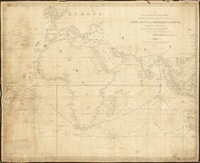
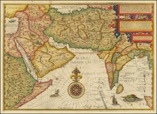
Although a chart primarily for the ocean, the map includes several landmark cities and islands. Athens, Jerusalem, Bombay, and Canton. Major and minor islands like Cyprus, Madagascar, Hong Kong, and Niphon (Japan) also appear.