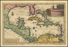


|
||

|

|
|

|
The Most Iconic Map of the Civil War.
This map, perhaps the most significant printed cartographic relic of the Civil War, was compiled in 1861 by Edwin Hergesheimer for the U.S. Coast Survey. It delineates the striking variances in the extent of slaveholding across the border and southern states, revealing the nuanced sociopolitical landscape of the era. Its principal historical significance lies in its instrumental role in guiding President Lincoln's strategies. Lincoln utilized this map as empirical evidence that the seemingly monolithic Confederacy was, in fact, internally divided—a strategic weakness that the Union could potentially exploit. This map is a monument of cartographic Americana and has been absent from the antiquarian market for two decades.
The map encompasses the border and southern states, detailing each county's boundaries and the course of significant rivers. Utilizing data gleaned from the 1860 Federal census, the map embeds within each county a figure that signifies the proportion of enslaved individuals relative to the total population. This ranges from a complete absence of enslaved persons in Hancock County in the Virginia panhandle to an alarming 91% in Concordia County, Louisiana. Additionally, each county has been shaded to illustrate the concentration of the enslaved population - the more intense the shading, the higher the enslaved population, with the darkest shade marking counties where enslaved persons constituted over 80% of the total population.
This map, issued on June 13, 1861, follows a predecessor: the "Map of Virginia Showing the distribution of its Slave Population from the Census of 1860." The earlier map presented a stark division within Virginia, with the coastal and piedmont regions steeped in the institution of slavery and the northern and mountainous western regions where slavery held only a marginal presence, a consequence of the unsuitability of the terrain for plantation agriculture.
The data for both maps were extracted from the United States Census of 1860. These maps, therefore, represent pioneering attempts within the United States to depict census data through cartography. The innovative nature of this technique can be discerned through a rudimentary error, wherein the percentage of enslaved persons in many of the counties appears inflated due to the omission of free Black individuals from the total county populations.
Despite this, the use of shading on the map of the southern and border states—maps utilizing this technique are known as "chloropleth" maps—makes the spatial patterns of slavery unmistakably apparent. The institution of slavery was primarily concentrated in the coastal and piedmont regions of the southern Atlantic states, extending inland along fertile riverine bottomlands. However, large areas, particularly the Appalachian uplands and the majority of Arkansas and Missouri, had a sparse presence of enslaved individuals.
The map conveyed two crucial messages. The first proposed that the instigator of secession and the ensuing Civil War was the institution of slavery. The states in the Deep South that spearheaded secession were the ones with the highest concentrations of enslaved populations. This observation was reinforced by a table at the bottom of the map that ranked states based on their dependence on slavery. The sequence in which the states seceded from the Union closely followed this hierarchy.
The second message was forward-looking and held strategic implications. The pronounced regional variations in slaveholding pointed towards potential cultural, economic, and political fault lines within the Confederacy that the Union could potentially exploit. For instance, Lincoln relied on this map to understand that Confederate states with a minimal presence of enslaved individuals might be susceptible to internal fissures.
The most successful Union exploit along these fault lines was in Virginia, where slavery was entrenched in the eastern and southern counties. After Virginia's secession on April 17, 1861, the western counties voted to secede from Virginia and rejoin the Union, and in 1863, they were recognized as the new state of West Virginia.
This map's significance to President Lincoln is evidenced by Francis Bicknell Carpenter’s 1864 painting "First Reading of the Emancipation Proclamation." Carpenter spent several months in the White House observing the President and his Cabinet at work. He noted Lincoln's frequent reference to the "Map Showing the Distribution of the Slave Population of the Southern States" and chose to incorporate it into his painting. It can be seen at the far lower left, just below the figure of Attorney General Edward Bates.
The map was copyrighted by commercial lithographer Henry Graham, but it bears the functional appearance of a government publication. Its title typography bears a striking resemblance to the work of the U.S. Coast Survey. Indeed, the map was a product of the Coast Survey, signed in print by Edwin Hergesheimer, a German émigré employed by the Coast Survey during the Civil War era.
Bache, the long-time Coast Survey Superintendent, was an avowed abolitionist and unionist. He intensified the charting and mapping of not only the Atlantic and Gulf Coasts, but also the Mississippi River and major Virginia rivers that fed the Chesapeake, well before the secession crisis of the late 1850s. During the war, he sanctioned the reassignment of Coast Survey personnel to terrestrial mapping projects and permitted the secondment of its mapmakers to military units in the field.
The map also bears the curious notice: "Sold for the benefit of the sick and wounded soldiers of the U.S. Army." This is likely because, in another capacity, Bache served as Vice President of the United States Sanitary Commission (USSC). Founded in June 1861 with Congressional, Presidential, and War Department approval, the USSC was a privately funded organization tasked with supporting the military in maintaining the well-being of soldiers and sailors. Bache evidently viewed the slavery maps as not only potent Union propaganda, but also as a means to raise funds for the USSC.
In conclusion, this map is a highly significant instance of thematic cartography, conceived and executed with the intention of shaping the course of events at a critical moment in the early stages of the Civil War.
![The North Coast of the Gulf of Mexico from St. Marks to Galveston . . . 1844 . . . Additions to 1856, including the Surveys of Comr. Powell, Lt. Simmes & Profr. Coffin, U.S. Navy [and] St. Marks to Galveston. Sheet II. . . . 1845. Additions to 1851 . . . .](https://storage.googleapis.com/raremaps/img/small/89497.jpg)
![(The First Letter From British Florida) [September 5, 1763, Autograph Letter, Signed, from Robert Campbell to John Campbell, 4th Earl of Loudoun, describing the British taking possession of Florida and the state of the settlement of Pensacola]](https://storage.googleapis.com/raremaps/img/small/86620.jpg)